Use our Tailwind CSS Avatar built with Angular to represent users or entities on your website. It can be useful for showing user images, icons, or any other visual cues.
The avatar is a UI component used by web developers as a visual representation of a user. They are widely used across many platforms, like social media sites, forums, and gaming platforms. They are also used for content authors when creating website blogs. Avatar components often work in combination with other elements.
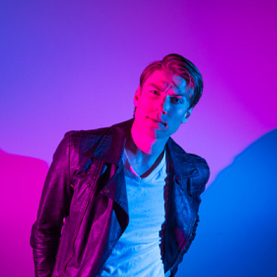
Below we present you our Angular Avatar example crafted with Tailwind CSS that will help you build enterprise-level applications with ease. Check it out!
You first need to import the DUIAvatar Module into your application module
import { DUIAvatar } from "david-ui-angular"; @NgModule({ declarations: [AppComponent], imports: [BrowserModule, DUIAvatar], providers: [], bootstrap: [AppComponent], }) export class AppModule {}
<dui-avatar src="../assets/avatar.jpeg"></dui-avatar> The Avatar component comes with 3 different variants that you can change it using the variant prop.
<div class="flex gap-3"> <dui-avatar src="../assets/avatar.jpeg" variant="circle"></dui-avatar> <dui-avatar src="../assets/avatar.jpeg" variant="rounded"></dui-avatar> <dui-avatar src="../assets/avatar.jpeg" variant="square"></dui-avatar> </div>
You can use different sizes of the avatar component by manipulating the size attribute of the component
<dui-avatar src="../assets/avatar.jpeg" size="xs"></dui-avatar> <dui-avatar src="../assets/avatar.jpeg" size="sm"></dui-avatar> <dui-avatar src="../assets/avatar.jpeg" size="md"></dui-avatar> <dui-avatar src="../assets/avatar.jpeg" size="lg"></dui-avatar> <dui-avatar src="../assets/avatar.jpeg" size="xl"></dui-avatar> <dui-avatar src="../assets/avatar.jpeg" size="xxl"></dui-avatar>
You can add border around the avatar using the addBorder prop. To change the color of the avatar border use the color prop, by default it's gray .
<div class="flex gap-3"> <dui-avatar src="../assets/avatar.jpeg" className="p-0.5" [addBorder]="true" color="green" variant="circle"></dui-avatar> <dui-avatar src="../assets/avatar.jpeg" className="p-0.5" [addBorder]="true" color="red" variant="rounded"></dui-avatar> <dui-avatar src="../assets/avatar.jpeg" className="p-0.5" [addBorder]="true" color="purple" variant="square"></dui-avatar> </div>
Tania Andrew
Web Developer
Tania Andrew
Web Developer
Tania Andrew
Web Developer
<div class="flex flex-col gap-6"> <div class="flex items-center gap-4"> <dui-avatar src="https://docs.material-tailwind.com/img/face-2.jpg" alt="avatar" /> <div> <dui-typography variant="h6">Tania Andrew</dui-typography> <dui-typography variant="small" color="gray" className="font-normal" > Web Developer </dui-typography> </div> </div> <div class="flex items-center gap-4"> <dui-avatar src="https://docs.material-tailwind.com/img/face-2.jpg" alt="avatar" variant="rounded" /> <div> <dui-typography variant="h6">Tania Andrew</dui-typography> <dui-typography variant="small" color="gray" className="font-normal" > Web Developer </dui-typography> </div> </div> <div class="flex items-center gap-4"> <dui-avatar src="https://docs.material-tailwind.com/img/face-2.jpg" alt="avatar" variant="square" /> <div> <dui-typography variant="h6">Tania Andrew</dui-typography> <dui-typography variant="small" color="gray" className="font-normal" > Web Developer </dui-typography> </div> </div> </div>


<div class="flex items-center -space-x-4"> <dui-avatar variant="circle" alt="user 1" className="border-2 border-white hover:z-10 focus:z-10" src="https://images.unsplash.com/photo-1633332755192-727a05c4013d?ixlib=rb-1.2.1&ixid=MnwxMjA3fDB8MHxwaG90by1wYWdlfHx8fGVufDB8fHx8&auto=format&fit=crop&w=1480&q=80" /> <dui-avatar variant="circle" alt="user 2" className="border-2 border-white hover:z-10 focus:z-10" src="https://images.unsplash.com/photo-1580489944761-15a19d654956?ixlib=rb-1.2.1&ixid=MnwxMjA3fDB8MHxwaG90by1wYWdlfHx8fGVufDB8fHx8&auto=format&fit=crop&w=1061&q=80" /> <dui-avatar variant="circle" alt="user 3" className="border-2 border-white hover:z-10 focus:z-10" src="https://images.unsplash.com/photo-1544005313-94ddf0286df2?ixlib=rb-4.0.3&ixid=MnwxMjA3fDB8MHxwaG90by1wYWdlfHx8fGVufDB8fHx8&auto=format&fit=crop&w=1288&q=80" /> <dui-avatar variant="circle" alt="user 4" className="border-2 border-white hover:z-10 focus:z-10" src="https://images.unsplash.com/photo-1506794778202-cad84cf45f1d?ixlib=rb-4.0.3&ixid=MnwxMjA3fDB8MHxwaG90by1wYWdlfHx8fGVufDB8fHx8&auto=format&fit=crop&w=1287&q=80" /> <dui-avatar variant="circle" alt="user 5" className="border-2 border-white hover:z-10 focus:z-10" src="https://images.unsplash.com/photo-1570295999919-56ceb5ecca61?ixlib=rb-4.0.3&ixid=MnwxMjA3fDB8MHxwaG90by1wYWdlfHx8fGVufDB8fHx8&auto=format&fit=crop&w=1760&q=80" /> </div>
The following properties are available for dui-avatar
| Attribute | Type | Description | Default |
|---|---|---|---|
variant | Variant | change avatar variant | filled |
color | Color | change avatar color | gray |
className | string | Add custom className for avatar | '' |
size | boolean | Change avatar size | md |
addBorder | boolean | add 2px border | false |